Sparks Magazine
Rebranding // Social Media
COLLABORATORS
Marketing Director: Ingrid Wu, Social Media Manager: Sally Zhu
TIME FRAME
Sept. 2020 - May. 2021
PROJECT TYPE
Rebranding, Concept Development, Visual Systems
A new vision of Sparks Magazine, mainly targeting Sparks national board, that is meant to create unity among the various chapters of Sparks.
Sparks Magazine is a non-profit organization that supports a collegiate student-run publication which consists of a national board and three chapters located in universities across Florida: University of Florida, University of South Florida, and the University of Central Florida. Sparks Magazine provides a mixed media platform for the Asian Pacific Islander/American (API/A) experience specifically in the South. This project is to rebrand the Sparks logo, and also, specifically, Sparks Magazine national board's social media.
Social Media // Visual System
TYPEFACES
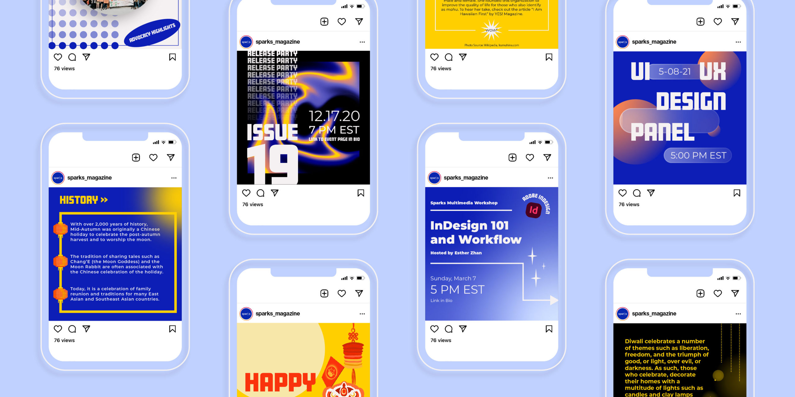
The typeface palette created for this social media rebrand consists of one bold display typeface, Amboy Black, and a more simple and easy to read typeface family, Monserrat, for the main copy.
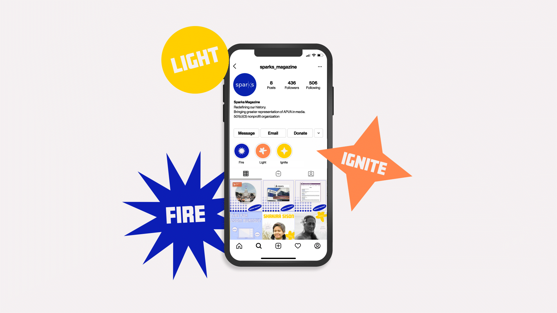
ICONOGRAPHY
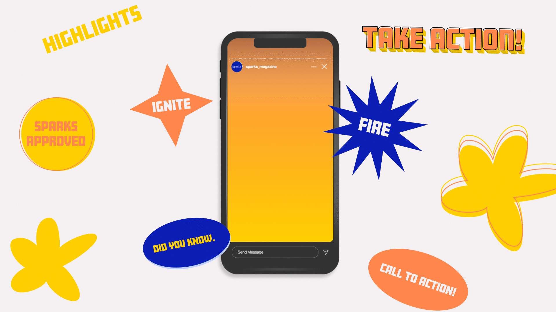
For the icon palette, there are three sets of icons for each category in which Sparks is divided: light, ignite, and fire. These can be used as stickers and symbols in social media graphics and also instagram stories.
COLOR PALETTE
For this rebrand, we decided to build on the existing brand by utilizing the original main color of Sparks, blue, as the initial inspiration. The choice of blue is representative of the blue flame, a flame that is of complete combustion. We decided to go with a more saturated blue for a more vibrant and bold look. Inspired by the three categories in which information is sorted (fire, ignite, and light), the expansion of the color palette coincides with the transition of a flame from blue to bright yellow. In addition, we included a black and an off-white to provide contrast to the vibrant colors.
Logo Process
This logo solution aims to keep the essence of sparks while increasing flexibility and scalability. After attempting various explorations, I would always come back to the original logo. This logo has become recognizable to Sparks and, therefore, I wanted to instead expand on it and come up with what would be an evolution to the next stage.
FIRST PROPOSAL
After presenting the first proposal to the national board members and the individual chapter members for feedback, I created a Google Forms survey to be sent to the chapters so that I could receive specific feedback on certain points that I heard brought up in meetings. From the results received, the main points I took note of were that they felt the thickness of the type was too heavy and that many of them held sentiments towards the representation of the 'k' in the previous logo. Since I wanted to maintain the essence of sparks in this rebrand, I decided to take these sentiments into account.
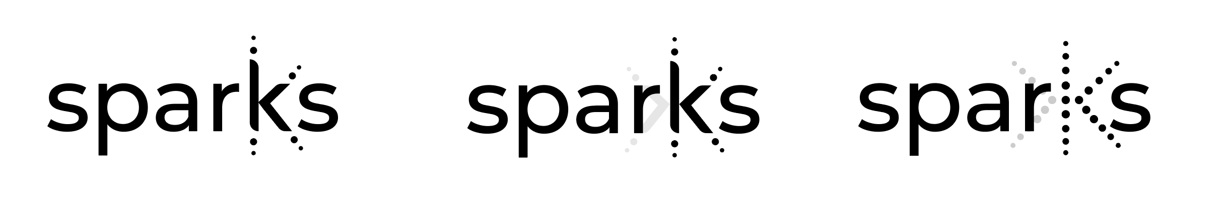
Final Deliverables
FINAL LOGO
After some more experimentation and discussions, taking into account all the feedback, I made the type thinner and changed the 'k' to be more similar to the original. However, keeping my original goal in mind, I simplified the incremental opacity changes to just two opacity levels.