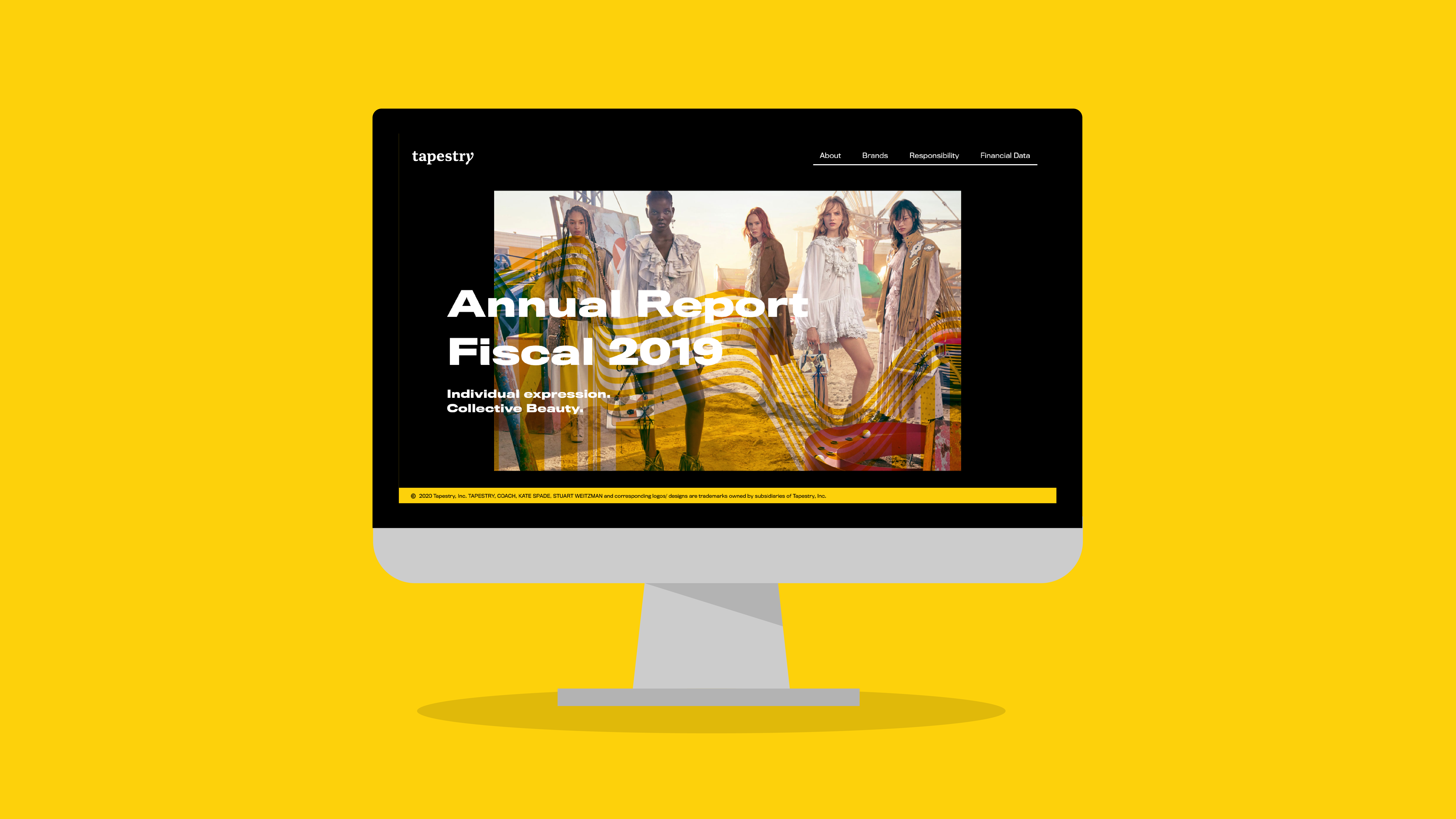
Tapestry Annual Report
UI/UX Design
TIME FRAME
Fall 2019
PROJECT TYPE
UI/UX Design, Visual System, Research, Content Management
A microsite based on the annual report of Tapestry, Inc., a fashion house that houses Coach, Kate Spade New York, and Stuart Weitzman.
For this project, the branding is an interpretation of the original Tapestry branding. Since the target audience for the annual report is stakeholders, the content is focused mainly on sales distribution and financial data among the three brands.
Visual System
ICONOGRAPHY
I wanted to expand on the already existing iconography of Tapestry Inc. to embrace the idea that all the brands are united but add their own personalities to create a unique fabric within the fashion industry. I wanted to create a simplistic, yet expressive experience for stakeholders so that they can quickly access the data they need and also experience the style of Tapestry.



TYPEFACES
For this project, I decided on a bold type family that comes in various weights and widths, Titling Gothic.
COLOR PALETTE
I wanted to stay true to the Tapestry brand and kept the color palette, black and yellow. However for my own interpretation, I decided to make the yellow more saturated to create a more vibrant contrast.
Primary Header Type

Display Type

Body Copy Type


Final Deliverables
ABOUT PAGE
The about page informs viewers about who they are and their origins as Coach. I felt it was important to include the timeline as it demonstrates Tapestry's growth and expansion.
BRAND PAGE
The brands page is a breakdown of the three brands housed by Tapestry. Since each brand has their own individual personality, I felt it was important to highlight while also showing how they work together as a whole by breaking down how each contribute within Tapestry.
RESPONSIBILTY PAGE
The responsibility section reflects their 2019 Responsibility Report that was broken down into three sections: our planet, our people, and our community. This page serves as a summary that highlights their achievements.
FINANCIAL DATA PAGE
The financial data was broken down and simplified down to key points mostly based around total and net profits.
